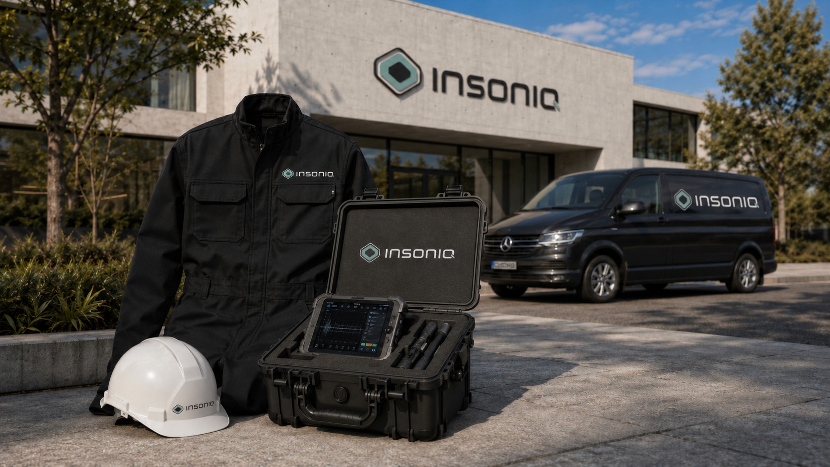
DESIGN
INSONIQ

Industry
Building Diagnostics
Year
2026
Client
Insoniq
Company Naming
Development of a distinctive company name that reflects the technology, purpose and innovative character of the business.
Company & Technology Concept
Clear communication of a non-destructive structural inspection technology that uses targeted impulses to detect and visualize hidden damage inside buildings and materials.
Logo Design & Branding
Development of the visual identity, including logo, color system, typography and a consistent brand language derived from the company’s technology and positioning.
Logo Concept
The logo represents non-destructive structural inspection through targeted impulses that reveal and visualize hidden damage inside a structure.
The icon combines a cube with layered geometry: the turquoise shape represents a scanning or detection layer, while the black inner cube suggests the core or a deeper structural level. At the same time, the overall symbol resembles a stylized eye, reinforcing the idea of looking beneath the surface — also reflected in the beginning of the name “insoniq.”
The turquoise element is repeated in the “Q”, symbolizing an impulse entering from the outside and focusing on a specific area within the structure.